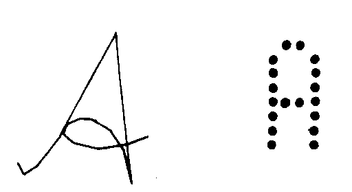
Stroke and Bit-mapped Forms of Letter A
Text in Graphics
Copyright (c) Susan Laflin. August 1999.
There are basically two methods of producing text on a computer screen; either the character may be drawn as a series of short straight-line segments or it may be displayed as a pattern of dots. The first may be thought of as the computer's equivalent of handwriting and the second as the equivalent of typing. Most home computers and character terminals use the second ("bit-pattern") approach because it is considerably faster. Plotters generally use the first approach and graphics screens may use either. Both approaches may allow the possibility of additional text fonts, provided the terminal or microcomputer has room to store the necessary information. The figure below shows a greatly enlarged version of these two methods for the letter A.
Stroke and Bit-mapped Forms of Letter A
The appearance of this type of text depends on the resolution of the screen and the number of bits used to represent each character, and it is not usually possible to change this. Many computer systems have one buffer for a text screen and another one for a graphics screen, and the extent to which these can be combined in output varies greatly from one type of computer to another. The text screen of the terminal or home computer will be divided into a number of rows and columns of characters, and each character position will contain a rectangular bit-pattern of pixels. The size of this rectangle is usually a compromise between the quality of the text and the quantity of text which can be displayed on the screen. Rectangles of 6x8 pixels or 8x8 pixels are frequently used since these allow a reasonable amount of medium quality text on each screen.
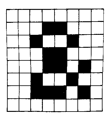 It is usual to leave a border round the character if possible so that it
can easily be read in a line of text. Now compare the pattern with the binary
representation, shown below:
It is usual to leave a border round the character if possible so that it
can easily be read in a line of text. Now compare the pattern with the binary
representation, shown below:
                          0 0 0 0 0 0 0 0
		          0 0 0 1 1 0 0 0
		          0 0 1 0 0 1 0 0
		          0 0 0 1 1 0 0 0
		          0 0 0 1 1 0 1 0
		          0 0 1 0 0 1 0 0
		          0 0 1 1 1 0 1 0
		          0 0 0 0 0 0 0 0
This same method is used on most dot-matrix printers, and again the number of
dots in the rectangle used to define the character is responsible for the
final appearance of the output. Some printers also provide a "near letter
quality" (NLQ) mode where each line is printed twice and is shifted by half
the space between dots for the second printing. This fills in the spaces
between the dots and gives a much blacker, solider result. Copying any
graphics characters on to a dot-matrix printer usually requires a special
dump program.
When working in graphics mode, it is possible to access all the pixel positions on the screen. This mode is used for output from G.K.S. and other graphics software. You may also use the stroke characters which have instructions to draw the character in any size and at any position. Such characters may be coded as a series of polyline calls, or they may require some means of calculating smooth curves to give a better representation of curved characters such as "s" or "o". In either case, they are stored as commands to draw the shape of the letter, not as bit-patterns. Consequently they may be shifted, scaled or rotated in the same way as any other drawing.
So far, the discussion has related to monochrome output, but many of the ideas are directly applicable to colour terminals. Text may be output in any colour of ink on any colour of background and when you are working with a system such as GKS, the choice of these colours is defined using attributes and colour tables before the text is output. When dealing with grey-scale devices, some work has been done on choosing the appropriate level of grey for each pixel position in the bit map in order to give a better impression of curved characters.
Text Output in GKS.
One form of Text output in GKS is the polymarker function. This has the same parameters as polyline, but instead of joining the points with straight lines, it draws a symbol at each point. The symbols may be chosen from the selection of the five symmetric characters, namely . * x + o
The other form is the function usually called gtext. Its parameters are a world coordinate (x,y) and a text string. The relationship between the coordinate and the rectangular box containing the text is controlled by the various setting of the GKS parameters.
One function is provided to set the choice of font and the size of the characters. This is still called "SetTextHeight", but since the choice of font determines the ratio of horizontal to vertical, increasing the height will also increase the overall size.
A second function may be used to set "Character Up Vector". It is assumed that the text is drawn along an Ox axis and the Up-Vector is the direction of the associated Oy axis. (You will probably find it useful to draw yourself a diagram for this). With stroke text, the characters are rotated as well as the axes. With bit-mapped text, the letters remain upright, but are output along the current direction of the x-axis.
The third function is "Text Path". The default is from left to right along the x-axis. Other possibilities are bottom to top, right to left and top to bottom. The text path determines the relative position of the second character output to the first and so on.
The last function is "Text Alignment". This determines where the coordinate (x,y) appears relative to the rectangle containing the text. The default is the bottom left hand corner. However the alignment can be left, centre or right in the x-direction and bottom, centre or top in the y-direction.
As an example, how would the output of a text string appear with a path from top-to-bottom and alignment centre top ?